In the second feature in this five-part series with Homestyle, we examine complex colour schemes with the Master Palette.
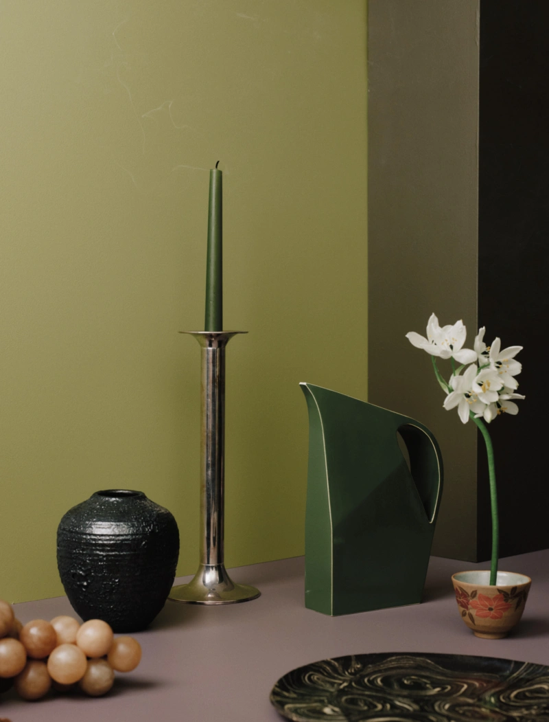
Colour relationships are not always about stark contrast. The most interesting pairings often fall just short of opposition, bringing a touch of the unexpected that feels inviting. Here, an elusive violet-tinged shade (Aalto Porcini) sits alongside a green touched with yellow (Aalto Salubrious), their connection anchored by the solid depth of Aalto Barrack.
Although the tones differ, the tension between them is softly purposeful. Porcini’s subtle complexity is lifted by the freshness of Salubrious, while Barrack grounds the palette. Together they form a scheme that feels refined and quietly confident, where each colour makes a contribution, without being overwhelming.
The theory: This palette creates quiet intrigue through a subtle complementary relationship. Porcini and Salubrious are both midtones, so their contrast is understated rather than stark. Barrack, a dark hue in the green family, provides structure and depth, linking with Salubrious while allowing the colours to converse in a restrained, inviting way.
The practice: Apply Aalto Porcini or Aalto Salubrious to walls or horizontal surfaces, then use Aalto Barrack to punctuate the scene in smaller accents such as furniture or architectural features.