In the third feature of this five-part series with Homestyle, we explore neutral and accent schemes with the Master Palette.
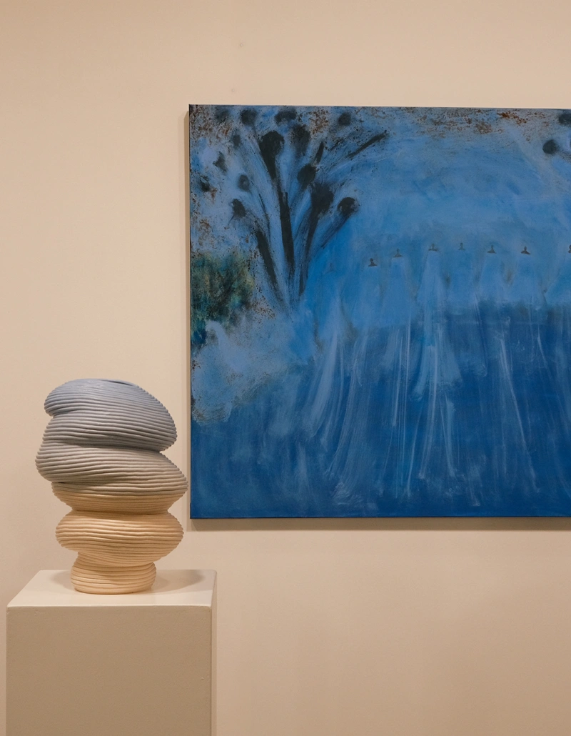
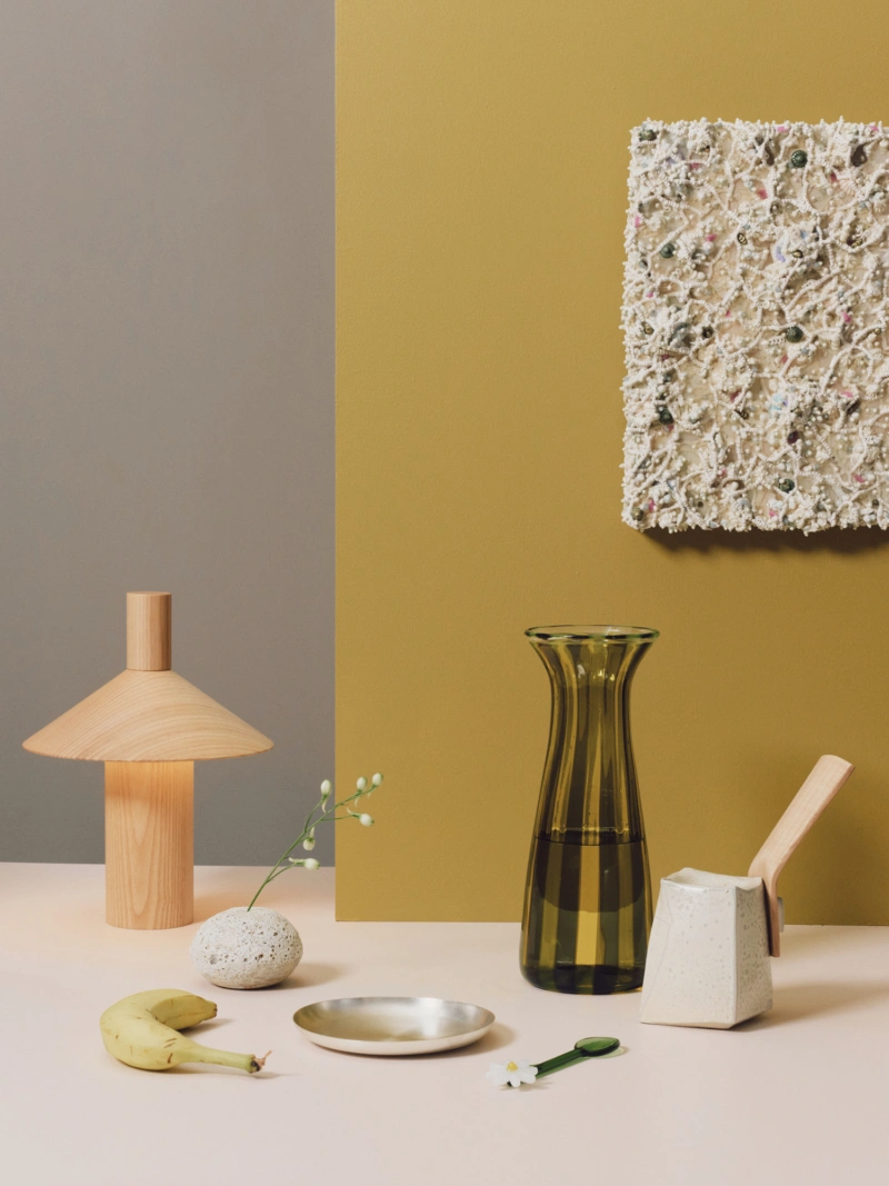
When calm meets conviction, a bold accent can redefine the entire mood. A neutral palette sets the stage for a moment of contrast, grounding the space before allowing a single, expressive hue to take focus. Here, the soft restraint of Aalto Classical and Aalto Evident creates a composed backdrop. These neutrals establish a sense of ease across surfaces, allowing the eye to settle. Cutting through this calm is Aalto Marrakesh — an arresting, brassy tone that brings warmth and energy. Its rich, earthy undertones nod to natural materials, while its intensity introduces a playful, confident edge.
The theory: This palette balances stillness with statement. Aalto Classical and Aalto Evident sit closer in tone, offering subtle variation within a neutral spectrum. Aalto Marrakesh acts as a deliberate interruption, its warmth and saturation designed to stand apart, creating a focal point that feels both considered and dynamic.
The practice: Use Aalto Classical and Aalto Evident across walls, ceilings and larger surfaces to establish a calm foundation. Introduce Aalto Marrakesh across defined architectural elements or key pieces of furniture. Think cabinetry, islands or built-in forms, allowing its vibrancy to feel intentional and immersive.