In the fourth feature in this five-part series with Homestyle, we explore analogous schemes with the Master Palette.
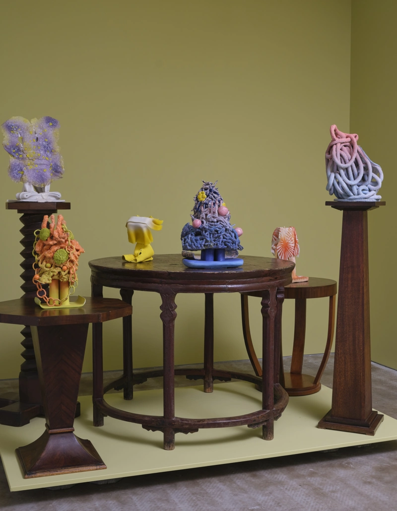
When every option is on the table, a little restraint can be the key to clarity. An analogous palette does just that, drawing from one section of the colour wheel, introducing neighbouring tones to create interest and cohesion.
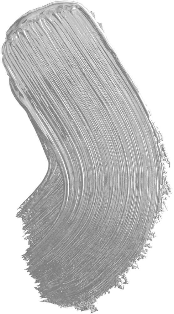
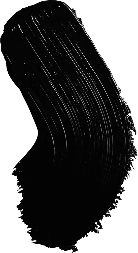
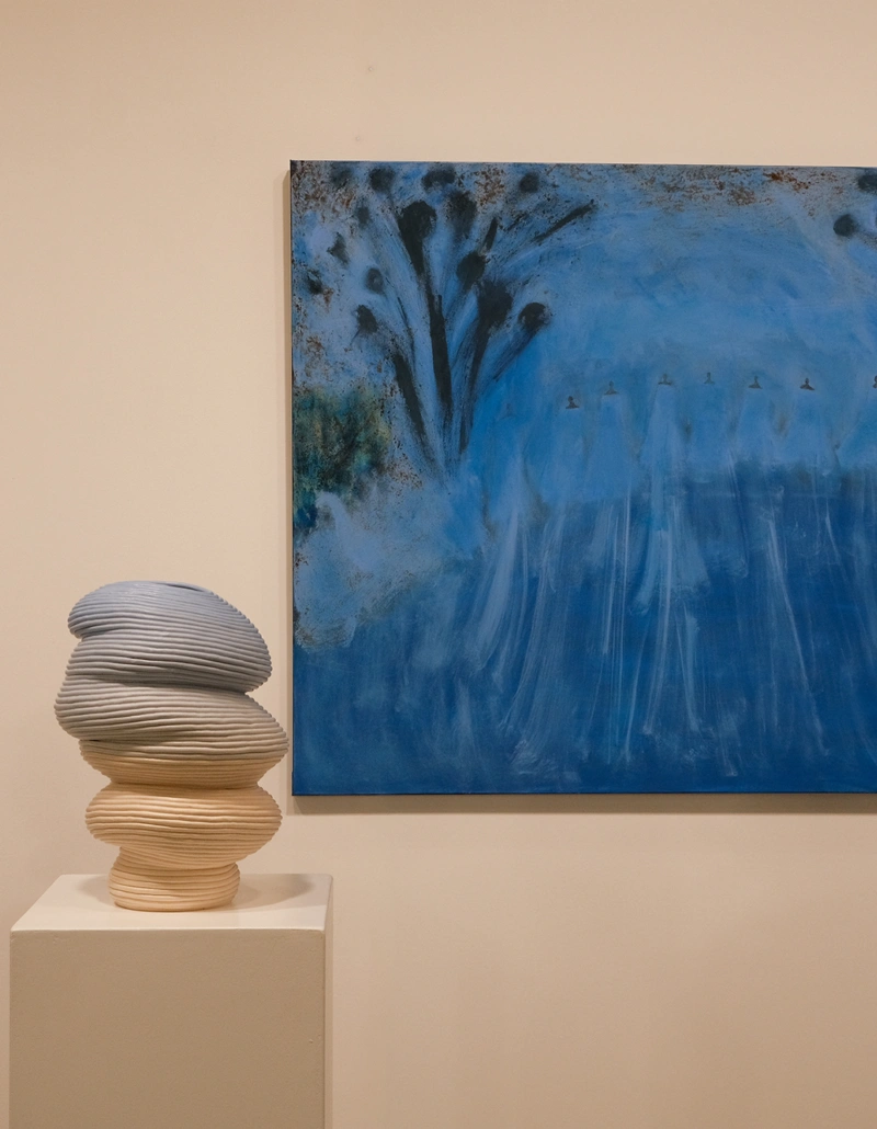
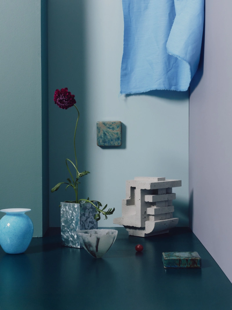
Here, hues that drift from shades of the sea to dusk sky sit comfortably alongside one another. A soft blue (Aalto Accolade) meets a grey-toned lilac (Aalto Last Light), while a jewel-like, complex green (Aalto Perplex) adds richness. These midtones, varied in strength, create a gentle interplay across surfaces, anchored by the darkness of Aalto Foretold—an inky teal chosen as a deeper counterpart to Aalto Perplex.
The theory: This palette builds visual layering through an analogous approach. Aalto Accolade and Aalto Last Light occupy a similar depth as neighbours on the colour wheel, offering subtle variation across planes. Aalto Perplex inserts a stronger hue within the same tonal family, while Aalto Foretold, a dramatic green-blue, adds a dose of pleasing contrast.
The practice: Apply Aalto Foretold to floors or large connecting areas, then use Aalto Accolade and Aalto Last Light on the walls and ceilings. Introduce Aalto Perplex on joinery—door frames, trims or cabinetry—for a measured point of difference.