The world of colour can feel endless with possibilities, so where do you even begin? For most of us, the answer is simple: whites and neutrals. They’re timeless, safe, and create a calm foundation in any space. But what comes next, if you’re not quite ready to jump into vivid, saturated shades?
The answer lies just beyond neutrals. This is the space where soft derivatives and toned-down hues come into play — the quiet achievers that bring depth and sophistication without overwhelming a room.
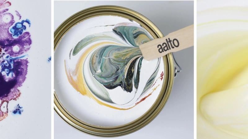
Think of Aalto’s Remain 1/2, Effect 1/4, or more atmospheric shades like Burnt Sugar. These are colours that whisper rather than shout, yet completely transform the feel of a space.
Aalto Remain 1/2
Expert Advice
Temperature
We often describe tones as either being warm or cool—but the magic often happens when you find one that sits perfectly in between. The multi-pigmented nature of Aalto colours mean that colours often have both traditional warm and cool undertones, and the visual perception of the colour temperature shifts when used across various schemes.
For example, while the initial perception of Aalto Remain is warm, the addition of a rich green pigment creates depth and allows it to sit comfortably alongside a deeper range of shades.
The result is a colour that works harmoniously across palettes, creating a sense of calm that works across different contexts.
Weight
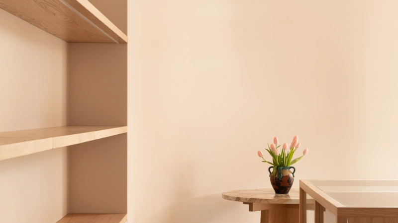
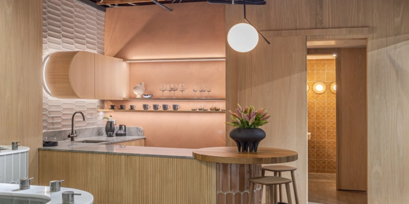
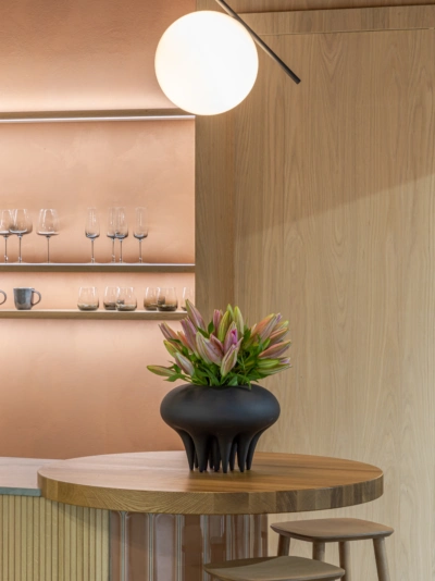
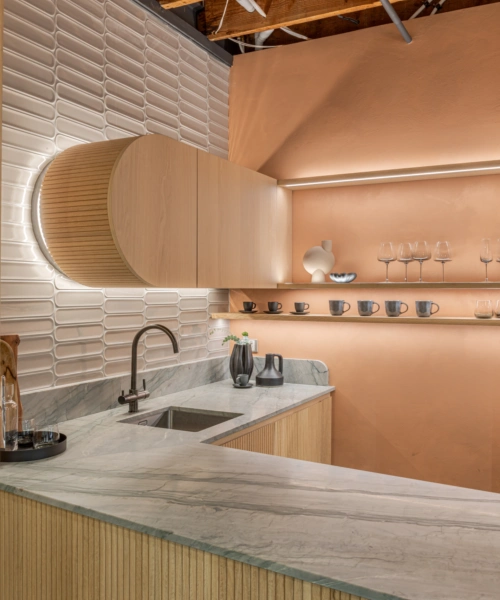
Some shades feel light and airy, others heavier and more grounding. In Deadly Ponies’ showroom, Effect 1/4 does the former, giving the interior a sense of lightness and space, and providing the perfect background to showcase high-end, luxury products. And while undoubtedly a pink-toned hue, balance is created through the addition of raw umber and natural ochre pigments, allowing this shade to act as a neutral.
Aalto Effect 1/4
Texture
Finish changes everything. We love using a range of sheen levels, whether across the same shade to create interest in a colour-drenched room, or as a highlight for architectural elements. Visually, the colour shifts gently across the gloss levels, creating subtle texture and adding a richness and depth to the space.
Light
No tone looks the same all day long. Aalto colours shift beautifully under changing lights—from soft and muted in the morning, to sharper and more defined under the warm evening light. It’s a reminder that colour is never static, and should be considered at all times of the day. Expert hint: use Aalto brushout samples to test colour throughout a space. Consider when and how each room is used, and how the colour feels at different times of the day.
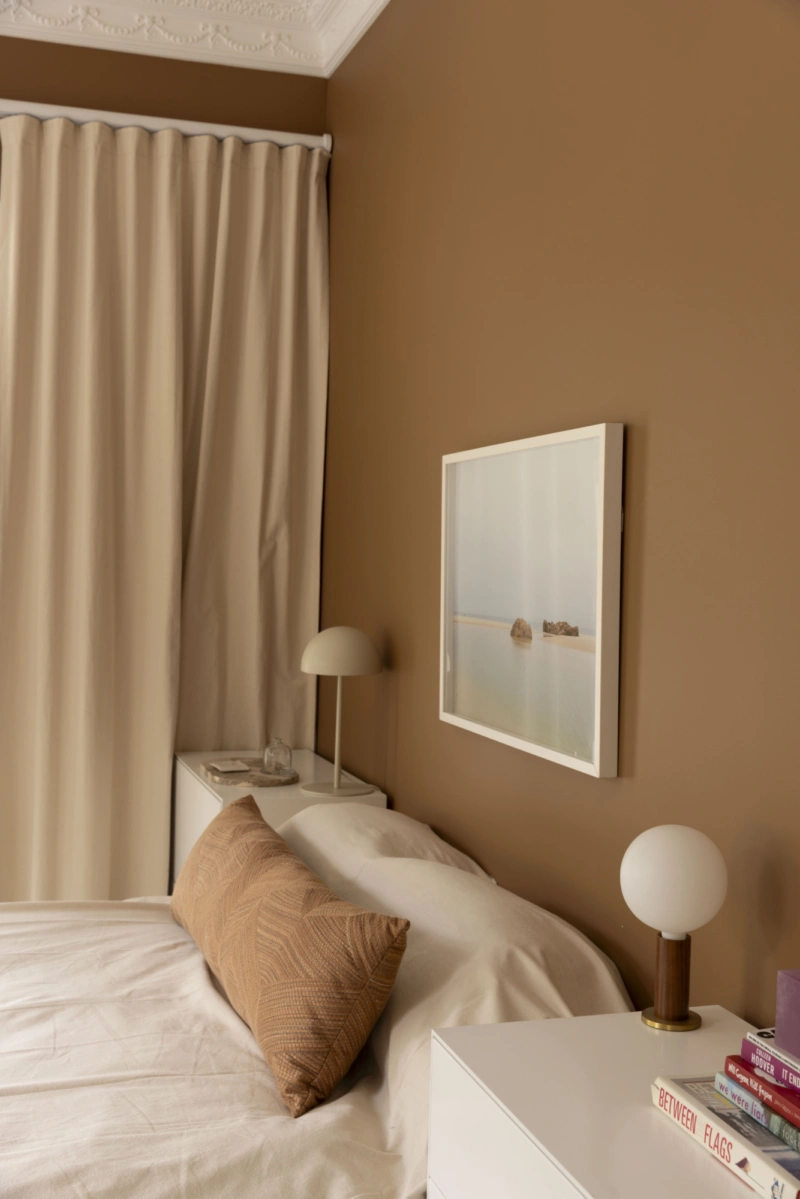
Aalto Burnt Sugar
Going beyond neutrals doesn’t necessarily mean going bold. It’s about finding a moment between that feels ‘right’, evoking the feeling you want to create within your space. Finally, while referencing the elements above can help shape and define your direction, we always suggest considering the space, and everything within and around it, rather than any elements in isolation.