Earlier this year, we partnered with the wonderful Anna Miles Gallery.
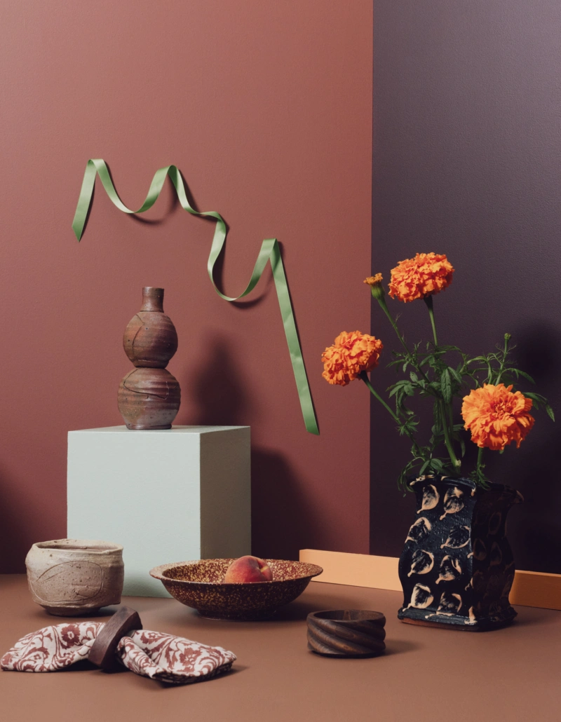
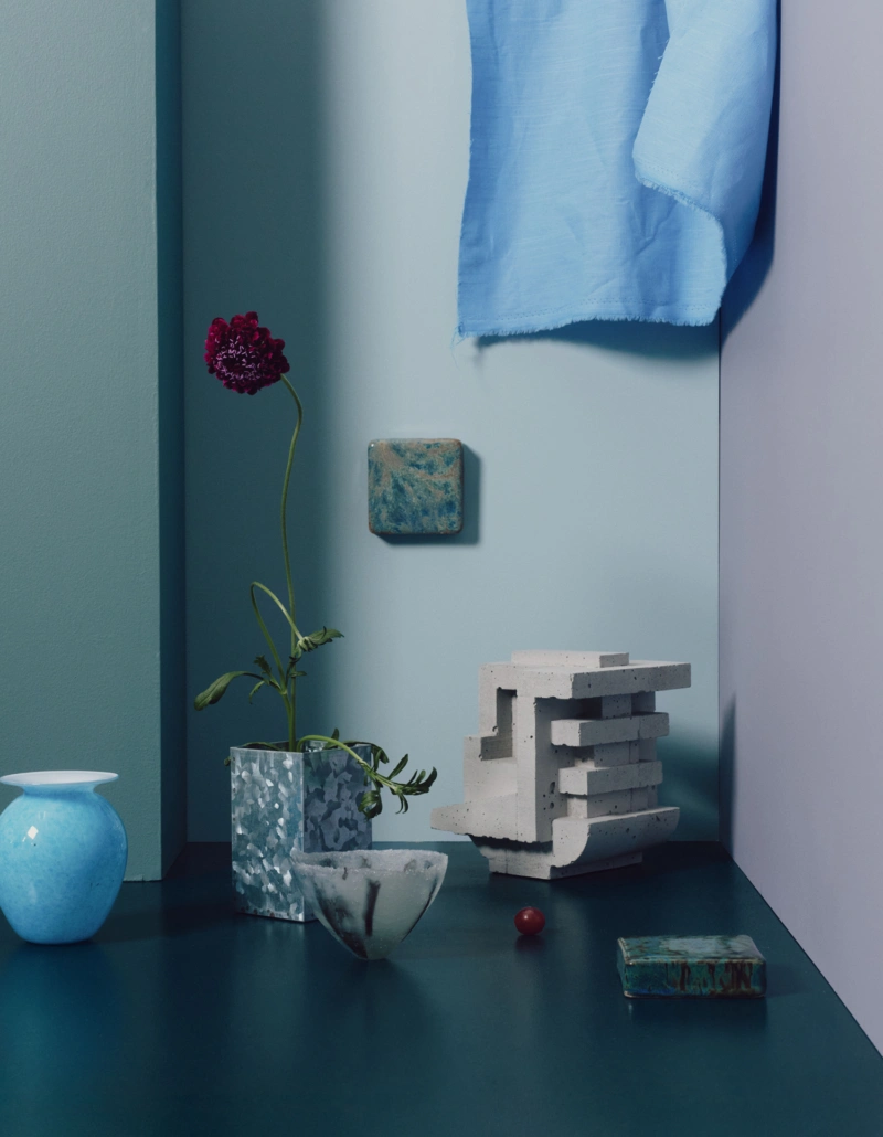
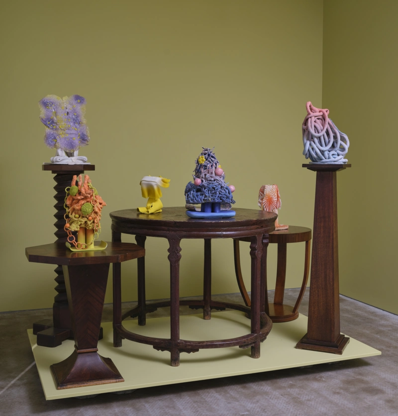
Tucked away on Upper Queen Street, the gallery appears unassuming from the outside but packs a punch once inside. It has been such a joy to see how Anna has incorporated bold and playful Aalto colours into each new exhibition.
Keep reading to see more from Anna about why colour and art is important, and what's currently inspiring her.
What drew you to Aalto, and what do you look for when choosing colour or paint for a space?
Aalto’s colours have complexity. There’s a mystery to them that tugs at deep parts of the brain. I also love the velvety softness of the Interior Matt. Choosing colour is subjective and intuitive — it’s all about feel. I often get very excited, thinking I’m veering into a whole new colour scenario, only to discover the same colour lurking in my wardrobe.
The brilliant Sam Hartnett, the photographer who documents exhibitions at the gallery, spots things in a split second. Photographing Barbara Tuck’s exhibition, he managed to snap me trying to get out of the picture. The little bit of my sock is a dead ringer for Guru, the Aalto purple in the gallery at the moment, along with Pocket Watch, a pale blue, and Kew Gardens, an indescribable limey yellow.
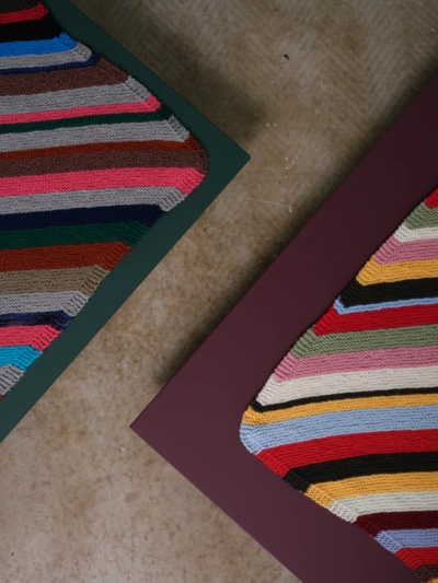
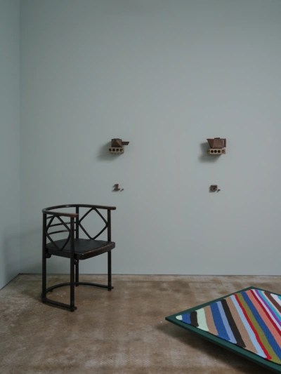
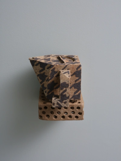
Isobel Thom and Ellen Thom’s WFH/Working from Home exhibition.
When people visit your gallery, what do you want them to feel?
I want them to feel very welcome — and as though they’ve stepped off the street into another world. The gallery overlooks a little-known leafy pocket of Symonds Street Cemetery, which helps.
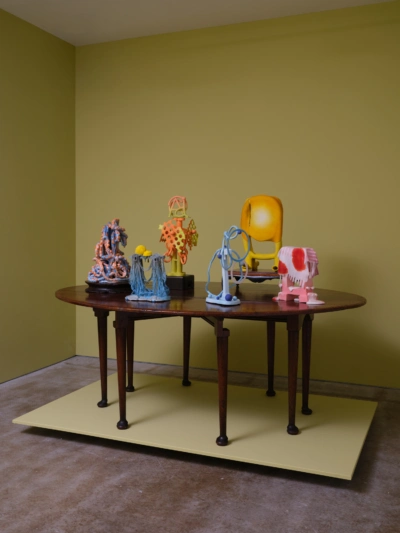
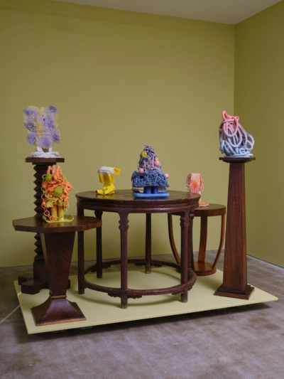
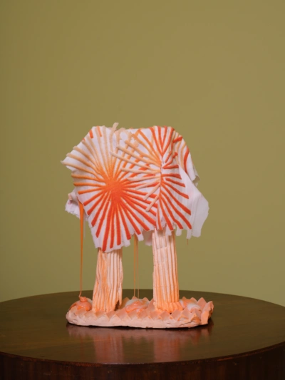
Everything Falls by Andrea du Chatenier.
Is there a colour you’re particularly drawn to at the moment?
I’m finding it very hard to stop using Kew Gardens, the indescribable yellow mentioned above.
How do you think the colour of a space changes the way we experience art?
Colour, like art, has the power to alter how you think and what you experience. The white cube has its place, but seeing art in a coloured space can be transformative. There is so much you can do with colour to alter the ways you experience both art and space.
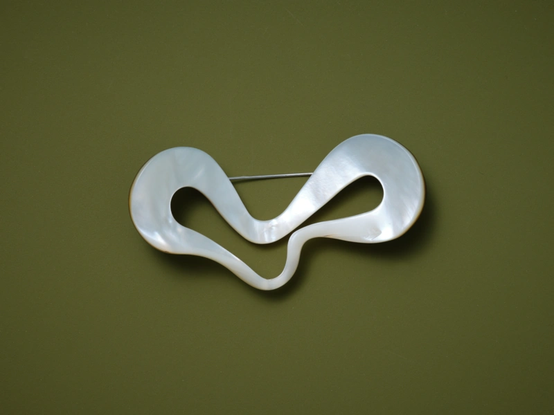
Warwick Freeman, Doodle (brooch), 2001 on Aalto Runaway.
What are you currently making, collecting, reading or looking at?
Barbara Tuck lent me a fantastic book on the ‘envelope writings’ of Emily Dickinson called The Gorgeous Nothings. Dickinson wrote in soft pencil on fragments of torn and flattened envelopes. Each small piece has a page of its own, facing a spidery diagrammatic drawing of the fragment. The words are typed and spaced as they appear in her handwriting.
The palette is incredibly limited — creams, ivories, manilla browns, the yellowed sticky edges of envelopes, grey handwriting. The book is absolutely mesmerising. It makes such a compelling case for the meaningful qualities of simple, material things.
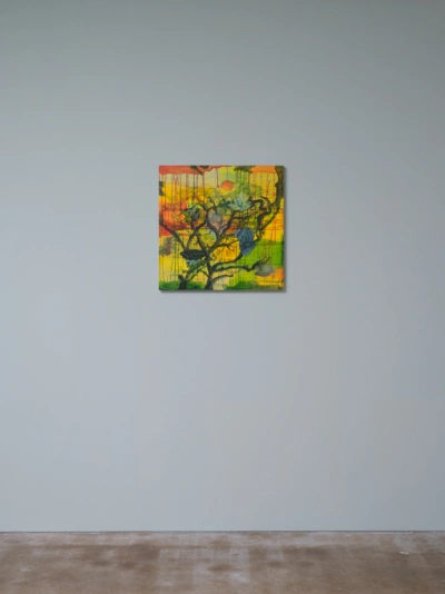
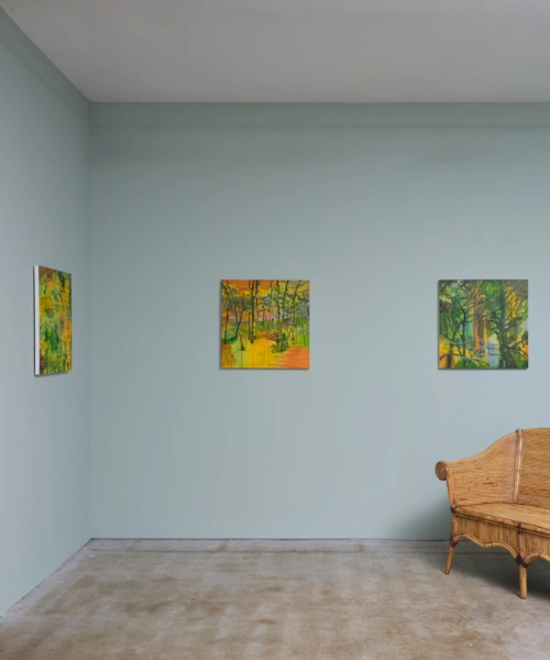
Barbara Tuck: Beneath the Rhapsodies of Fire.
Whose work are you excited by at the moment?
It’s hard to go past Barbara Tuck’s paintings in the gallery at the moment, and the lifetime of painting experience that underpins them. You could spend years looking and still not unravel them.
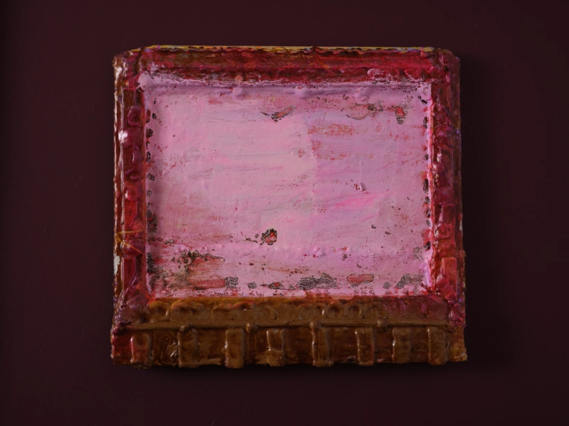
Aalto Guru as the backdrop for 'Dairy Queen' by Cat Fooks.