In the final feature of the Homestyle Colour Theory series, we explore warm and cool schemes with the Master Palette.
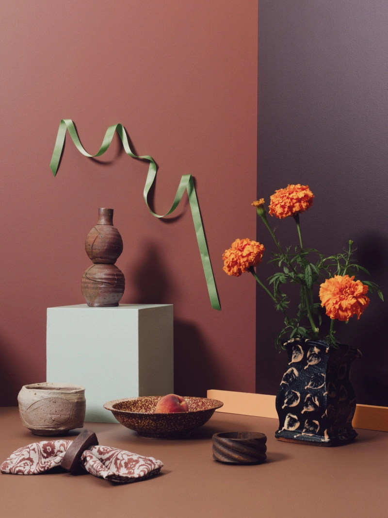
Building on the idea of analogous palettes explained in the previous edition, here we shape a base from warm neighbouring hues, contrasted with something pale and icy. We began by selecting a colour that, after each leaf through of the Master Palette fandeck, stood out. Nuanced clay-brick Aalto Court Shoe is a beautiful shade for interiors.
Alongside it on the colour wheel is Aalto Lady Jane, an elegant ‘almost-black’ red and, another sidestep away, a second midtone—Aalto Crema—a sophisticated caramel brown. Aalto Aperol lends an energetic pop in the vein of its namesake drink. It shares brightness and levity with minty crisp Aalto Fiction, creating a bridge for this outside colour to fit right in.
The theory: This palette layers warm-spectrum midtones and darks in an analogous way, and invites lights and brights for contrast in both warm and cool hues. As neighbours on the colour wheel, Aalto Court Shoe and Aalto Crema have a similar strength, while Aalto Lady Jane adds drama in its darkness (yet also skews warm). Aalto Aperol is a shot of visual energy and lightness, acting as a playful connector to the light, cool green tone of Aalto Fiction.
The practice: Aalto Court Shoe, Aalto Lady Jane and Aalto Crema make for chic, inviting wall colours and could easily sit alongside one another or in different rooms, with Aalto Aperol an artfully subversive choice for skirting boards or smaller interior details. Introduce Aalto Fiction on furniture or cabinetry as a standalone structure to contrast to the warm scheme.